Case Study

2026

Nazzh Topup's

Category Project

Internship Project

Duration

07 Weeks

Year

2024

Participant

Daffa Nazhiiff Muttahar

Role

UX/UI Designer

In 2024, during my internship, I helped design a top-up platform concept to enhance usability and ensure a seamless user journey. The project focused on intuitive navigation, simplified payments, and a consistent design system for confident transactions.

In 2024, during my internship, I helped design a top-up platform concept to enhance usability and ensure a seamless user journey. The project focused on intuitive navigation, simplified payments, and a consistent design system for confident transactions.

Overview

2026

Problem

Visual Inconsistency

Visual Inconsistency

Visual Inconsistency

Inconsistent styles created a confusing navigation.

Inconsistent styles created a confusing navigation.

Unclear Contrast

Unclear Contrast

Unclear Contrast

Weak contrast made key actions harder to spot, reducing clarity.

Weak contrast made key actions harder to spot, reducing clarity.

Slow Performance

Slow Performance

Slow Performance

Heavy and unoptimized components slowed down responsiveness. Without proper optimization, users experienced laggy interactions and longer loading.

Heavy and unoptimized components slowed down responsiveness. Without proper optimization, users experienced laggy interactions and longer loading.

Solution

Visual Complexity

-75%

Transaction Speed

2x

System Lag

-80%

Unified Visual System

Implementing a strict design language establishes a highly cohesive interface architecture. Optimizing color contrast and typography maximizes readability, ensuring critical transaction actions are immediately identifiable and minimizing cognitive friction.

Component-Level Optimization

Re engineering heavy UI components significantly accelerates overall system responsiveness. A structurally optimized and fluid transaction flow eliminates interaction delays.

Research

Gathering Requirements

At the beginning of my internship project on Nazzh Store, I focused on understanding how users currently interact with top-up game platforms and where the experience often breaks down.

Through this process, I discovered recurring issues inconsistent visuals, poor readability due to weak contrast, and slow performance that made transactions feel unreliable. These findings became the foundation for my design direction.

At the beginning of my internship project on Nazzh Store, I focused on understanding how users currently interact with top-up game platforms and where the experience often breaks down.

Through this process, I discovered recurring issues inconsistent visuals, poor readability due to weak contrast, and slow performance that made transactions feel unreliable. These findings became the foundation for my design direction.

Research Discovery

Early observations revealed that many top-up platforms lacked a consistent design language and often relied on cluttered layouts that made navigation confusing. In addition, users faced unclear contrast in key sections, leading to difficulty reading prices or verifying top-up details.

Early observations revealed that many top-up platforms lacked a consistent design language and often relied on cluttered layouts that made navigation confusing. In addition, users faced unclear contrast in key sections, leading to difficulty reading prices or verifying top-up details.

Ideation

As patterns from the journey began to take shape, I wanted to see how everything connects. The sitemap refined the flow uncovered during the journey mapping, outlining a structured path that balances clarity and function. Each section was designed to minimize friction and guide users toward completing their goals efficiently.

As patterns from the journey began to take shape, I wanted to see how everything connects. The sitemap refined the flow uncovered during the journey mapping, outlining a structured path that balances clarity and function. Each section was designed to minimize friction and guide users toward completing their goals efficiently.

Wireframing

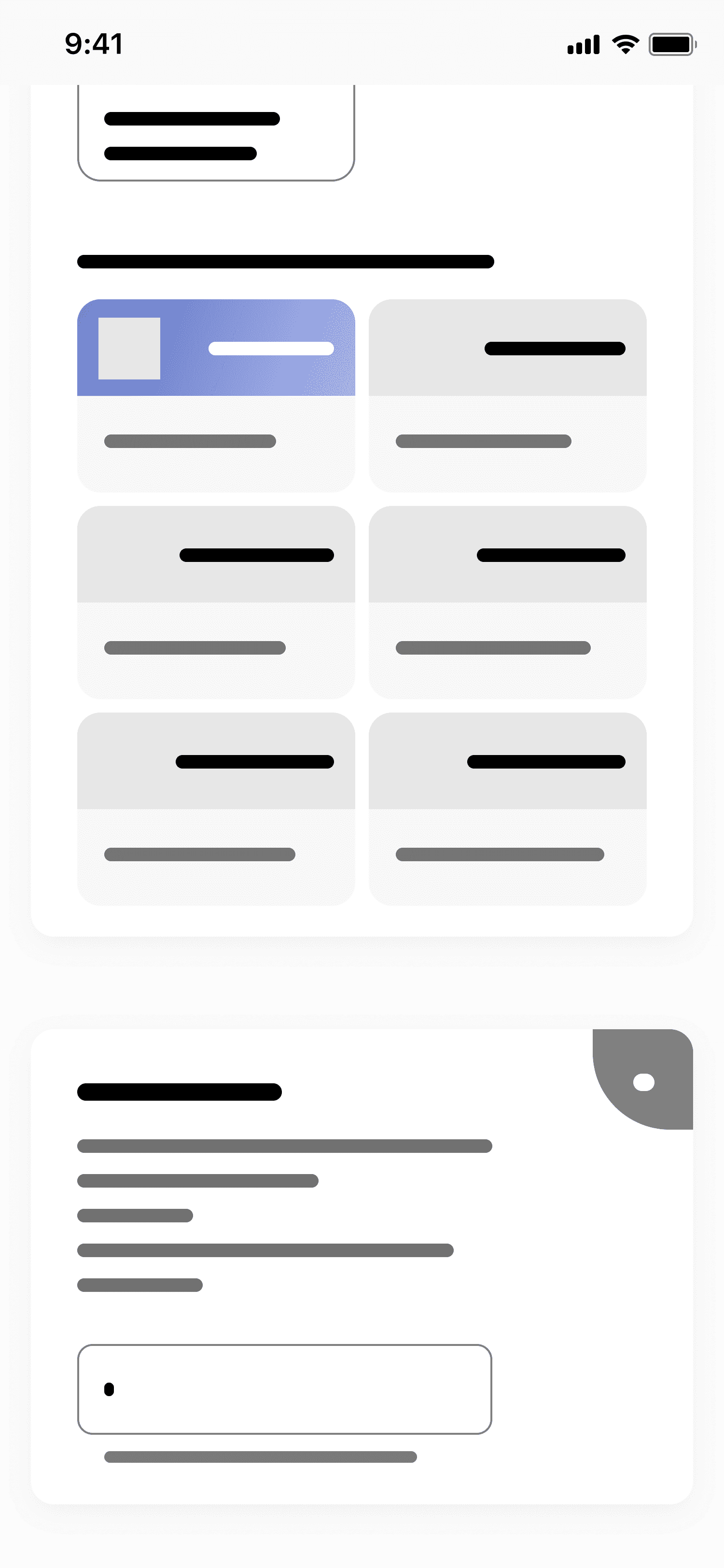
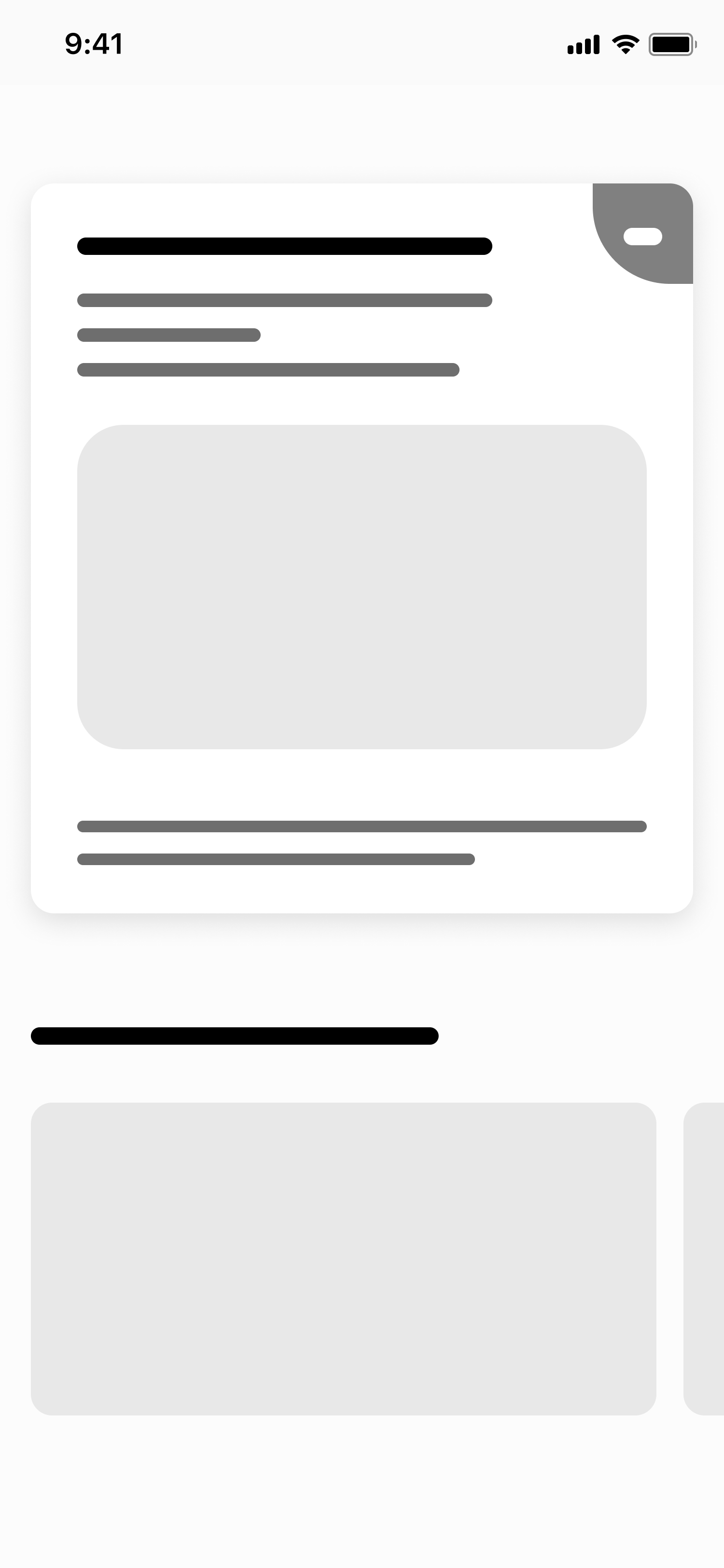
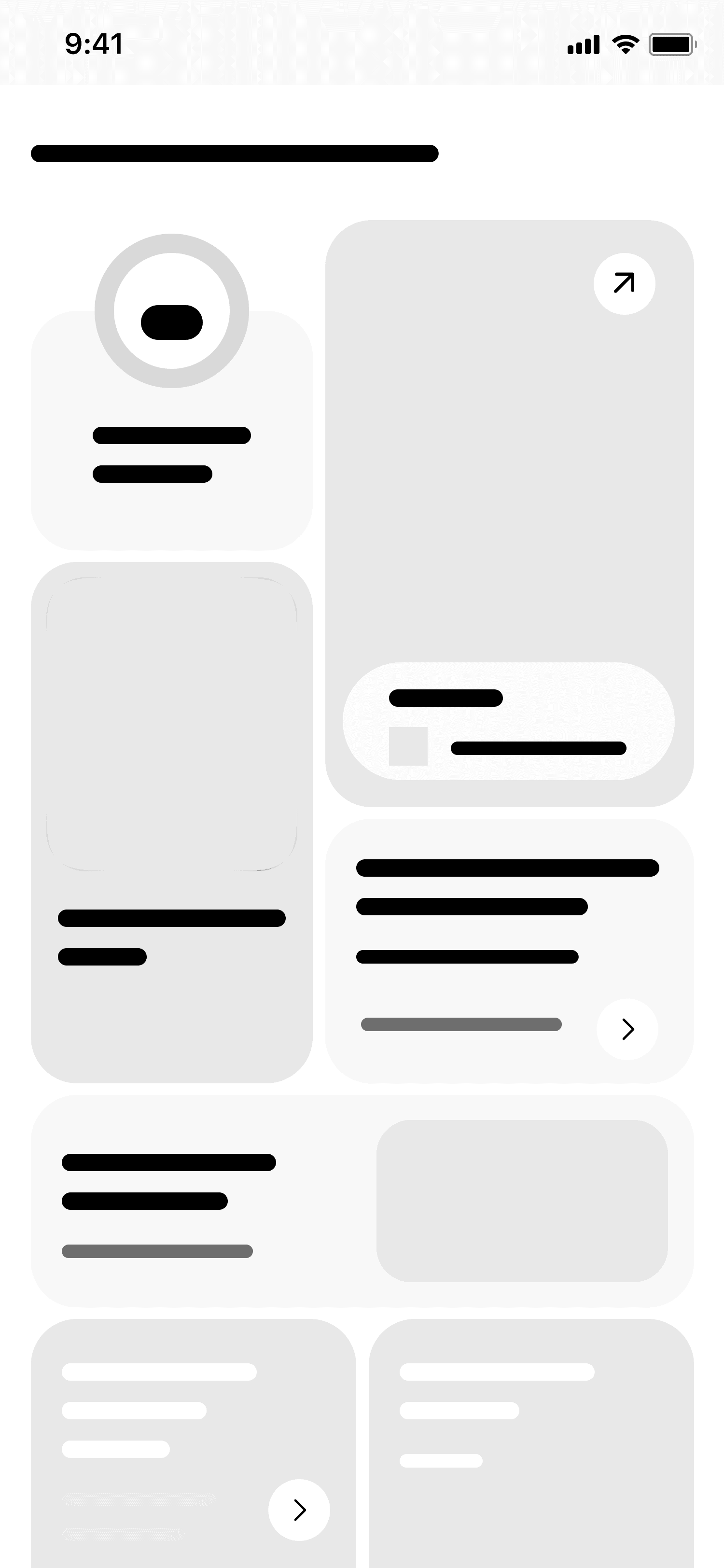
I moved forward with transforming rough ideas into low-fidelity wireframes. The goal of this stage was to define layout hierarchy, navigation structure, and core functionality before moving into visual design.

I moved forward with transforming rough ideas into low-fidelity wireframes. The goal of this stage was to define layout hierarchy, navigation structure, and core functionality before moving into visual design.

Prototyping

Instead of starting with low-fidelity prototypes, I moved directly to high-fidelity prototyping to accelerate validation. Since the layout and structure were already defined, hi-fi flows enabled faster usability testing and clearer feedback.

Instead of starting with low-fidelity prototypes, I moved directly to high-fidelity prototyping to accelerate validation. Since the layout and structure were already defined, hi-fi flows enabled faster usability testing and clearer feedback.

High Fidelity Mockups

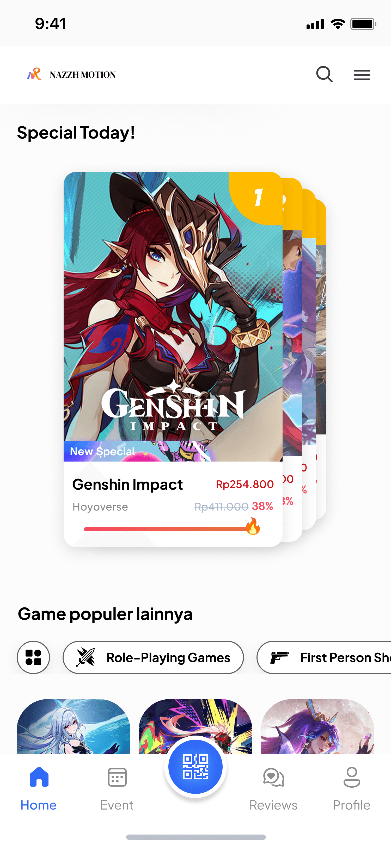
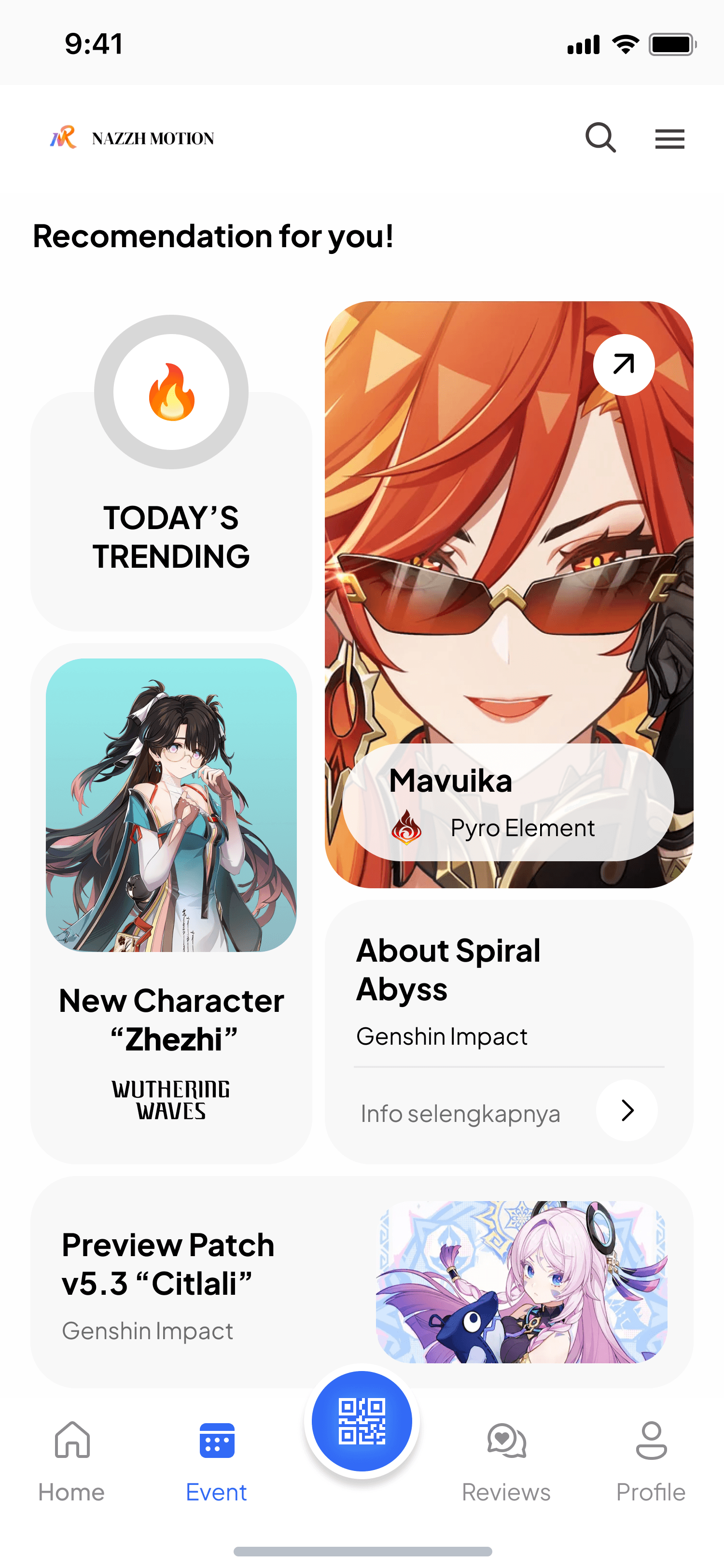
In this stage, I finalized the visual layout, typography scale, spacing rules, and component behavior. These hi-fi mockups also served as a reference for building a consistent UI system before development.

The application is currently under development.

In this stage, I finalized the visual layout, typography scale, spacing rules, and component behavior. These hi-fi mockups also served as a reference for building a consistent UI system before development.

The application is currently under development.

User Testing

To ensure the design worked well for gamers, I conducted usability tests with a small group of each. The feedback helped refine navigation and clarified how announcements and events were displayed.

To ensure the design worked well for gamers, I conducted usability tests with a small group of each. The feedback helped refine navigation and clarified how announcements and events were displayed.

Documented

2026

Design System

Plus Jakarta Sans

Primary Font

Delivers clean geometric construction and maximum legibility across digital interfaces. Applied systematically to major headers, service labels, and critical UI components to establish immediate visual hierarchy and instant scannability.

+

About Image
About Image
About Image
About Image

+

Blue

Primary Color

Serves as the core brand anchor, reflecting energy, approachability, and everyday mobility. Applied strategically to primary call-to-actions (CTAs), active states, and key interactive touchpoints to drive engagement and highlight primary services.

Grey

Neutral Color

Provides essential structural balance and accessible contrast throughout the ecosystem. Utilized systematically for backgrounds, modular borders, and secondary typography to establish crisp visual boundaries and minimize cognitive fatigue.

Closing

2026

Reflection

Critical evaluation and guidance from senior designers provided fresh perspectives on structural weaknesses within initial iterations

Critical evaluation and guidance from senior designers provided fresh perspectives on structural weaknesses within initial iterations

User Feedback is Essential

Continuous feedback from the end-users ensured the platform met their needs

User Feedback is Essential

Continuous feedback from the end-users ensured the platform met their needs

User Feedback is Essential

Continuous feedback from the end-users ensured the platform met their needs

Edge Case Resilience

Early prototyping phases revealed a systemic reliance on ideal user journeys (happy paths). Edge cases, such as failed payment gateways or network timeouts, were initially under-designed. Subsequent iterations strictly focused on building robust error-handling states to maintain platform trust during transaction failures.

Edge Case Resilience

Early prototyping phases revealed a systemic reliance on ideal user journeys (happy paths). Edge cases, such as failed payment gateways or network timeouts, were initially under-designed. Subsequent iterations strictly focused on building robust error-handling states to maintain platform trust during transaction failures.

Edge Case Resilience

Early prototyping phases revealed a systemic reliance on ideal user journeys (happy paths). Edge cases, such as failed payment gateways or network timeouts, were initially under-designed. Subsequent iterations strictly focused on building robust error-handling states to maintain platform trust during transaction failures.

© 2026 Nazzh

®. All rights reserved.

© 2026 Nazzh

®. All rights reserved.

© 2026 Nazzh

®. All rights reserved.

Create a free website with Framer, the website builder loved by startups, designers and agencies.