
Ideas that Move Brands


CORE INITIATIVES
2026
Dedicated ecosystems designed for exploration in technical optimization and curated visual UI inspiration.


Case Study
®2026
+
+
+
01
Redesigning Tokopedia
Weeks Duration

+
+
( The Challenge )
Initial observations identified friction points caused by visual overload, inconsistent product data structures, and a complex checkout sequence. This complexity hindered efficient product discovery and reduced transaction confidence.
( The Strategy )
The interface was restructured to prioritize essential features. The solution introduces a highly focused homepage, instantly scannable product details, and a straightforward payment flow to ensure total cost transparency.
Framework
Primary Tools
User Centered Design
Figma & Miro
02
Redefining The Gojek
Weeks Duration

+
+
( The Challenge )
The platform's evolution into a comprehensive super-app resulted in a crowded home interface saturated with secondary services and promotions. This high visual density hindered navigation and created cognitive overload for everyday.
( The Strategy )
The interface was systematically restructured to reduce top-level choices and defer secondary actions. By prioritizing the four primary services, the layout is optimized for speed, immediate clarity, and habitual usage patterns.
Framework
Primary Tools
User Centered Design
Figma & Miro
03
New Travelio
Weeks Duration

+
+
( The Challenge )
The original interface suffered from severe visual congestion, buried CTA, and fragmented comparison flows. These friction points, combined with obscured pricing structures, resulted in significant cognitive fatigue.
( The Strategy )
The solution introduces a de-cluttered discovery phase utilizing interactive property cards and live price animations. A new horizontal swipe-to-compare hub and a highly transparent checkout sequence were implemented.
Framework
Primary Tools
User Centered Design
Framer
04
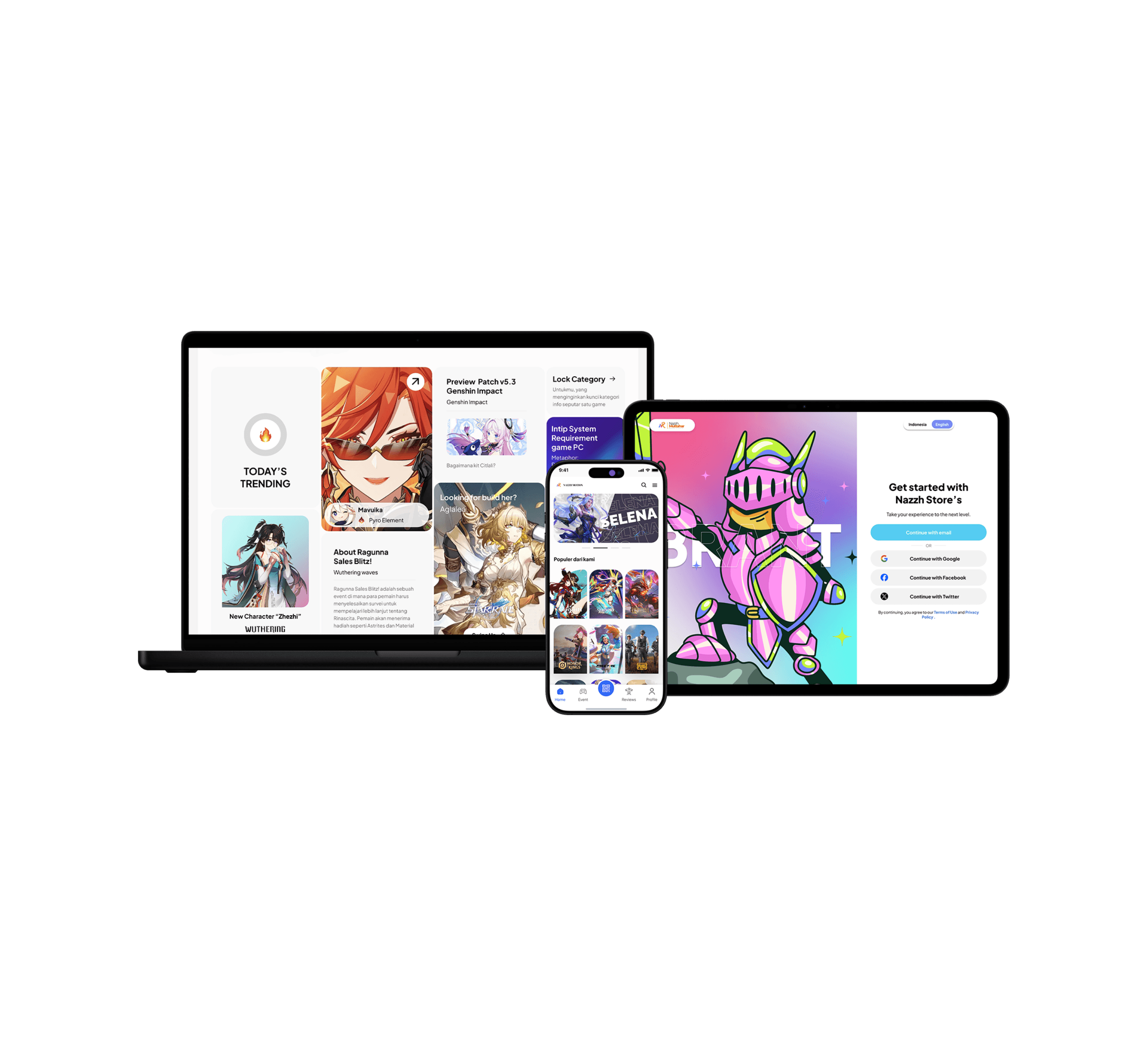
Nazzh Topup's
Weeks Duration
+
+
( The Challenge )
Initial audits revealed that existing top-up platforms suffered from severe visual inconsistency, weak contrast, and unoptimized components. These usability flaws resulted in laggy interactions, difficult navigation.
( The Strategy )
The interface was systematically rebuilt using a unified design language to maximize accessibility and visual hierarchy. Core navigation and checkout flows were streamlined, while component structures were optimized and reliable top-up journey.
Framework
Primary Tools
Human Centered Design
Figma & Miro