Case Study

2026

New Travelio

Category Project

Real Project

Duration

13 Weeks

Year

2025

Participant

Daffa Nazhiiff Muttahar

Role

UX/UI Designer

This redesign transforms Travelio's outdated, overcrowded interface into a clean, interactive travel booking experience. By introducing intuitive hooks like one-tap filters, and swipe to compare, users can discover, and book accommodations effortlessly.

This redesign transforms Travelio's outdated, overcrowded interface into a clean, interactive travel booking experience. By introducing intuitive hooks like one-tap filters, and swipe to compare, users can discover, and book accommodations effortlessly.

Overview

2026

Problem

Crowded Interface

Crowded Interface

Crowded Interface

Dense text walls and 50+ tiny elements per screen made property scanning impossible

Dense text walls and 50+ tiny elements per screen made property scanning impossible

Confusing Checkout

Confusing Checkout

Confusing Checkout

Buried CTAs, unclear total costs (hidden fees), and non-linear payment flow caused 60% cart abandonment

Buried CTAs, unclear total costs (hidden fees), and non-linear payment flow caused 60% cart abandonment

Poor Comparison Flow

Poor Comparison Flow

Poor Comparison Flow

No side-by-side property view users had to tap through 5+ screens to compare prices/amenities

No side-by-side property view users had to tap through 5+ screens to compare prices/amenities

Solution

Visual Noise

-60%

Comparison Steps

01

Price Transparency

90%

Streamlined Discovery

A simplified layout reduces cognitive overload and decision fatigue. Introducing a frictionless swipe-to-compare mechanism enables instant, side-by-side property evaluation without multi-screen navigation.

Transparent Checkout

Re-engineering the payment flow enforces upfront financial transparency. Eliminating hidden fees and establishing a linear checkout sequence neutralizes user anxiety and minimizes cart abandonment.

Research

Auditing Current App

A comprehensive UX audit of the current Travelio interface was conducted to isolate major friction points across the navigation flows, address interface clutter, and evaluate overall layout clarity.

A comprehensive UX audit of the current Travelio interface was conducted to isolate major friction points across the navigation flows, address interface clutter, and evaluate overall layout clarity.

Analyzing Similiar Apps

A granular competitive benchmarking of market-leading hospitality platforms was executed to map out industry-standard interaction patterns.

A granular competitive benchmarking of market-leading hospitality platforms was executed to map out industry-standard interaction patterns.

Search Bar

Abstract blue shapes create an interesting pattern.

Category/Filter

Abstract blue shapes create an interesting pattern.

Detail Information

Abstract blue shapes create an interesting pattern.

Payment Overview

Abstract blue shapes create an interesting pattern.

Social Proof & Reviews

Abstract blue shapes create an interesting pattern.

Profile Interactive

Abstract blue shapes create an interesting pattern.
Affinity Mapping

Clustering qualitative insights into critical pillars: financial transparency, interface congestion, and visual verification. This synthesis successfully structuralized core user behaviors, uncovering severe decision fatigue from overlapping text walls and massive comparison inefficiencies between property listings. These consolidated data points prioritized targeted architectural fixes.

Clustering qualitative insights into critical pillars: financial transparency, interface congestion, and visual verification. This synthesis successfully structuralized core user behaviors, uncovering severe decision fatigue from overlapping text walls and massive comparison inefficiencies between property listings. These consolidated data points prioritized targeted architectural fixes.

User Journey Mapping

Mapping the end-to-end rental lifecycle to isolate behavioral friction and conversion drops from discovery to post-check-in stages.

Mapping the end-to-end rental lifecycle to isolate behavioral friction and conversion drops from discovery to post-check-in stages.

Site Map

Re-architecting the information design into a flat hierarchy to eliminate navigation complexity and accelerate property discoverability.

Re-architecting the information design into a flat hierarchy to eliminate navigation complexity and accelerate property discoverability.

Mockups

Transforming architectural blueprints into high-fidelity screens, enforcing consistent spacing rules, modern grid layouts, and interactive component behaviors.

Transforming architectural blueprints into high-fidelity screens, enforcing consistent spacing rules, modern grid layouts, and interactive component behaviors.

User Testing

Conducting scenario-based usability tests to validate property booking flows, price transparency, and neutralize conversion barriers for potential tenants. The feedback helped refine navigation and clarified how announcements and events were displayed.

Conducting scenario-based usability tests to validate property booking flows, price transparency, and neutralize conversion barriers for potential tenants. The feedback helped refine navigation and clarified how announcements and events were displayed.

Documented

2026

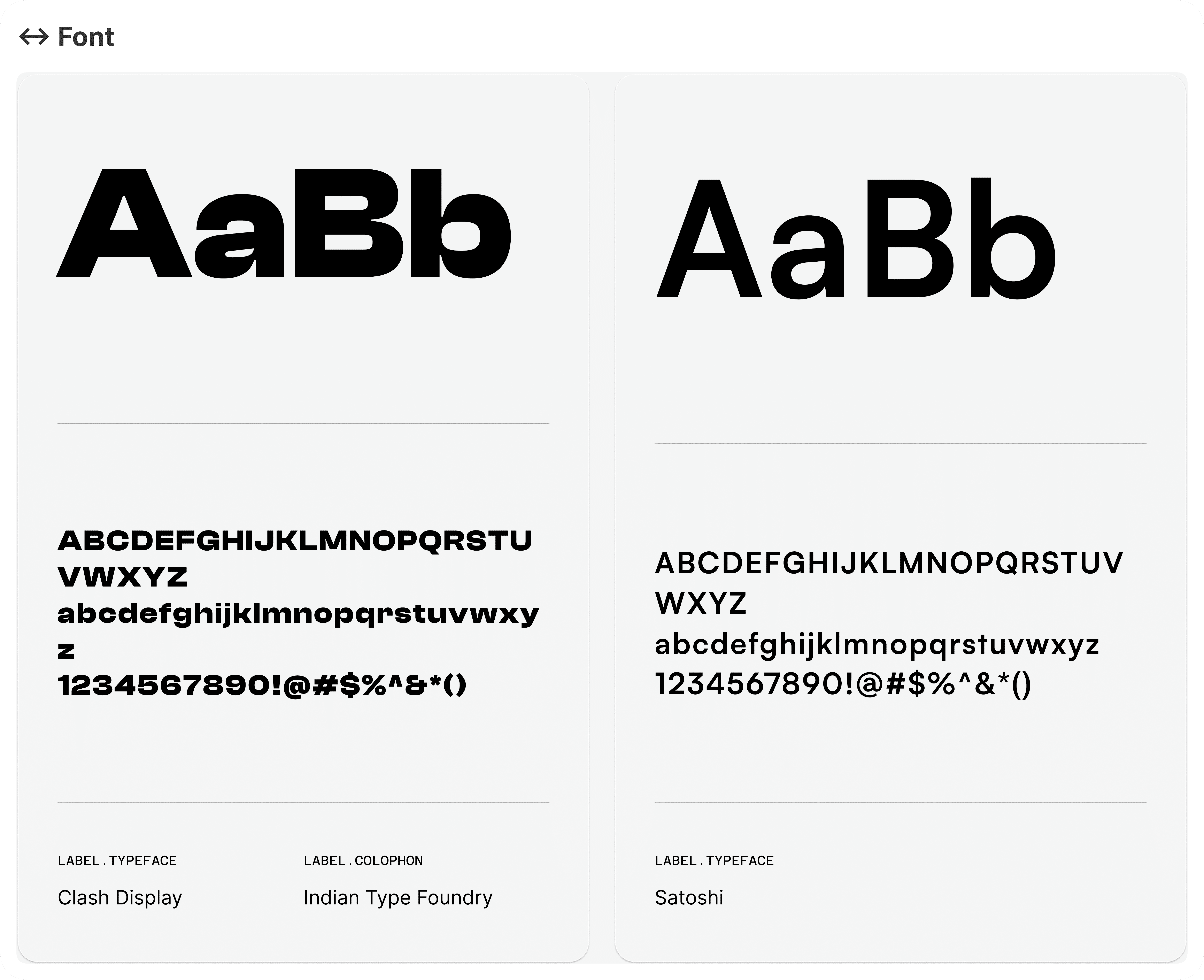
Design System

Clash Display

Primary Font

Delivers clean geometric construction and maximum legibility across digital interfaces. Applied systematically to major headers, service labels, and critical UI components to establish immediate visual hierarchy and instant scannability.

Satoshi

Secondary Font

Optimized for dense body copy, transactional metadata, and detailed service descriptions. The clean proportions maintain a rigorous typographic structure, ensuring razor-sharp readability and reducing visual clutter across complex viewports.

+
About Image
About Image
About Image
About Image

+

Blue

Primary Color

Serves as the core brand anchor, reflecting energy, approachability, and everyday mobility. Applied strategically to primary call-to-actions (CTAs), active states, and key interactive touchpoints to drive engagement and highlight primary services.

Grey

Neutral Color

Provides essential structural balance and accessible contrast throughout the ecosystem. Utilized systematically for backgrounds, modular borders, and secondary typography to establish crisp visual boundaries and minimize cognitive fatigue.

Closing

2026

Reflection

Critical evaluation and guidance from senior designers provided fresh perspectives on structural weaknesses within initial iterations

Critical evaluation and guidance from senior designers provided fresh perspectives on structural weaknesses within initial iterations

Mobile Architecture (In Development)

The mobile adaptation is currently undergoing active structural development. The preview below demonstrates the translation of the de-cluttered discovery architecture into smaller viewports, specifically optimizing the swipe-to-compare mechanism for fluid touch interactions.

Mobile Architecture (In Development)

The mobile adaptation is currently undergoing active structural development. The preview below demonstrates the translation of the de-cluttered discovery architecture into smaller viewports, specifically optimizing the swipe-to-compare mechanism for fluid touch interactions.

Mobile Architecture (In Development)

The mobile adaptation is currently undergoing active structural development. The preview below demonstrates the translation of the de-cluttered discovery architecture into smaller viewports, specifically optimizing the swipe-to-compare mechanism for fluid touch interactions.

© 2026 Nazzh

®. All rights reserved.

© 2026 Nazzh

®. All rights reserved.

© 2026 Nazzh

®. All rights reserved.

Create a free website with Framer, the website builder loved by startups, designers and agencies.