Case Study
2026

Redesign Tokopedia
Category Project
Internship Project
Duration
08 Weeks
Year
2024
Participant
Daffa Nazhiiff Muttahar
Role
UX/UI Designer
Overview
2026
Problem
Solution
Visual Clutter
-80%
Info Scannability
2x
Checkout Steps
03
Interface Architecture
Simplifying layout structures reduces visual cognitive load while highlighting primary features. Reorganizing critical product details allows seamless scanning of prices variants, enabling immediate user decision-making.
Transaction Optimization
Redesigning the payment flow establishes a linear and transparent user journey. Eliminating unnecessary friction points ensures full visibility of total costs.
Research
Design Journey
Gathering Requirements
Navigation Bar

Quick Access Menu

Today’s Deals
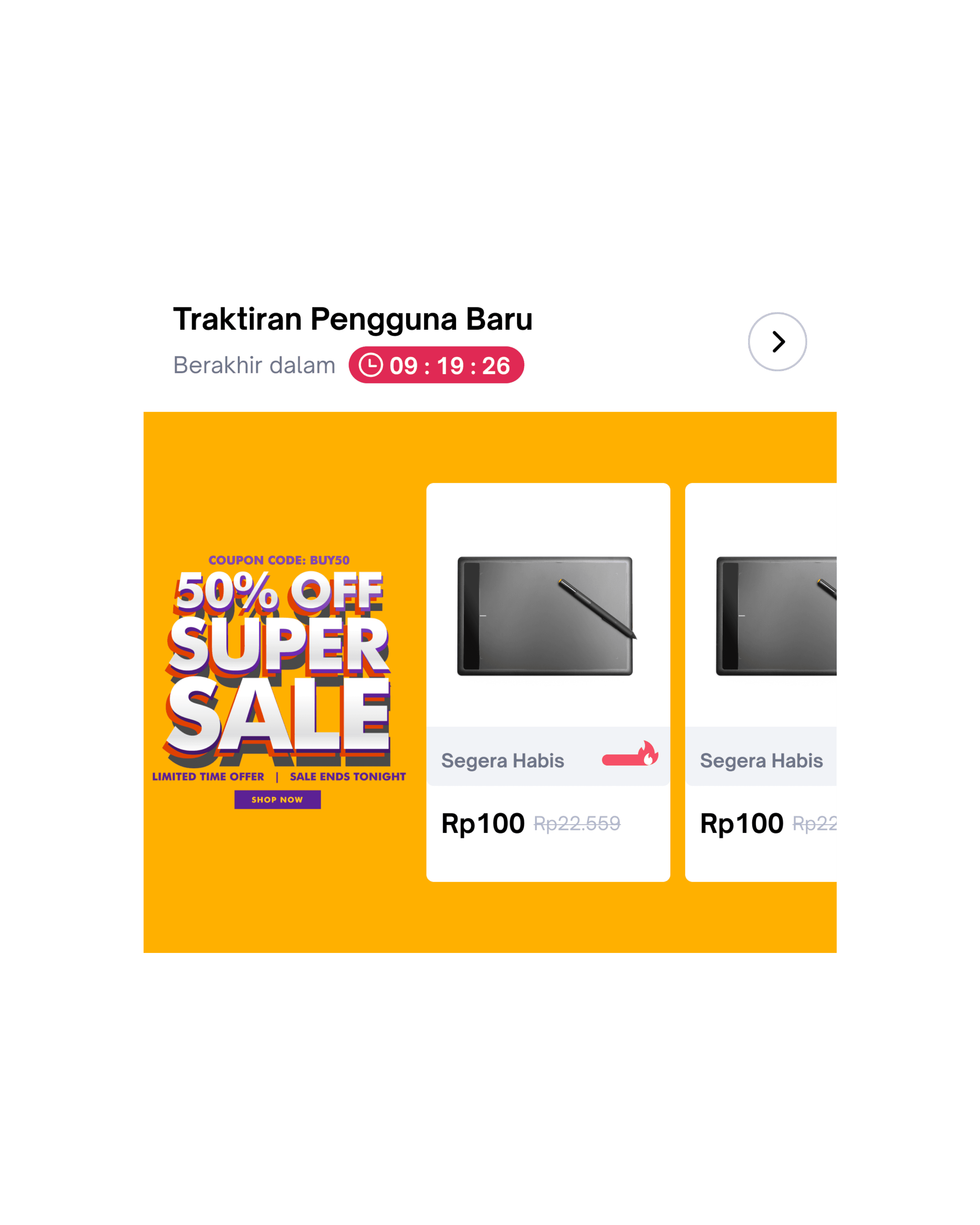
Browse Categories

Price Overview

Popular Products

Research Discovery
Navigation Bar

Quick Access Menu
Today’s Deals

Browse Categories
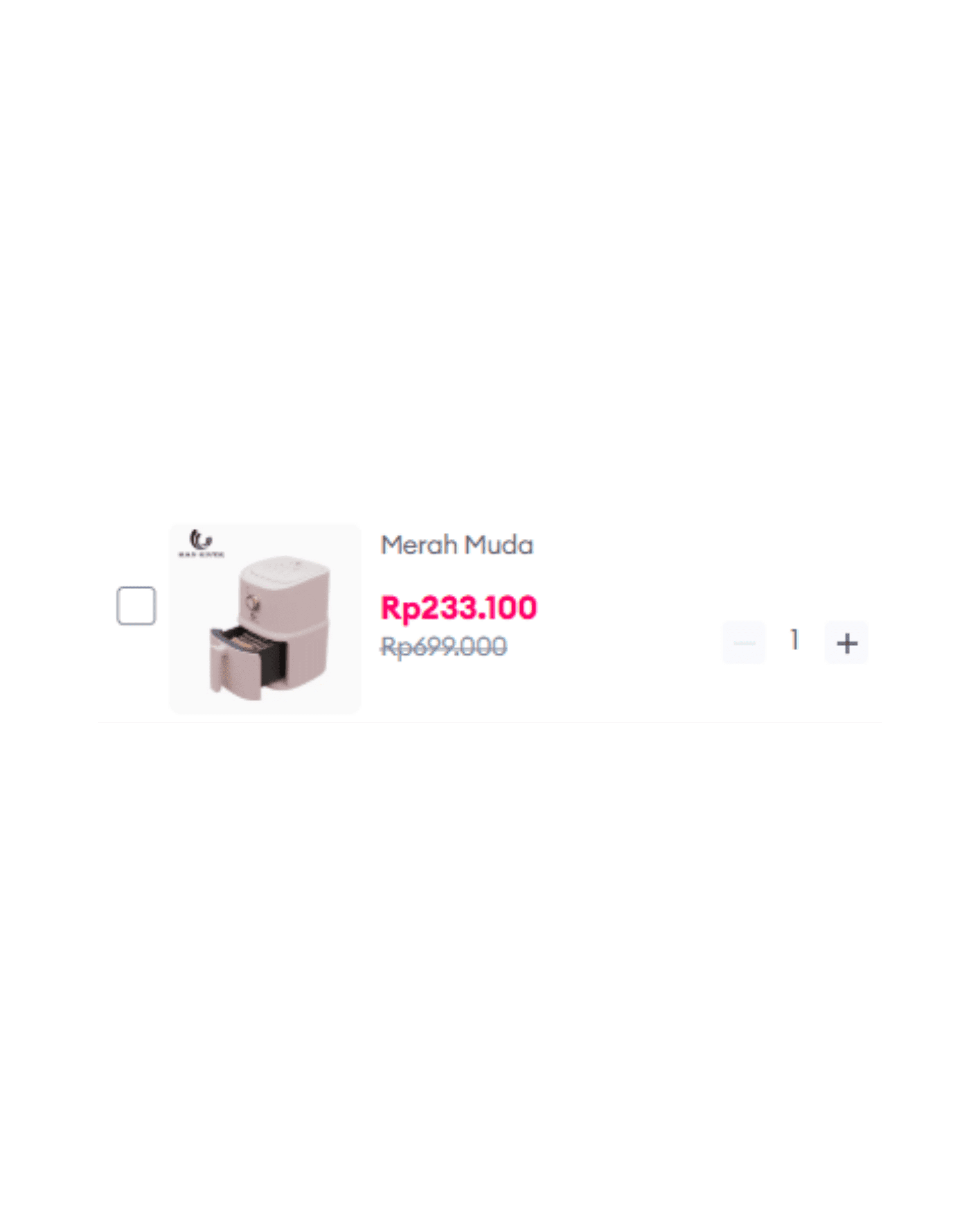
Price Overview

Popular Products

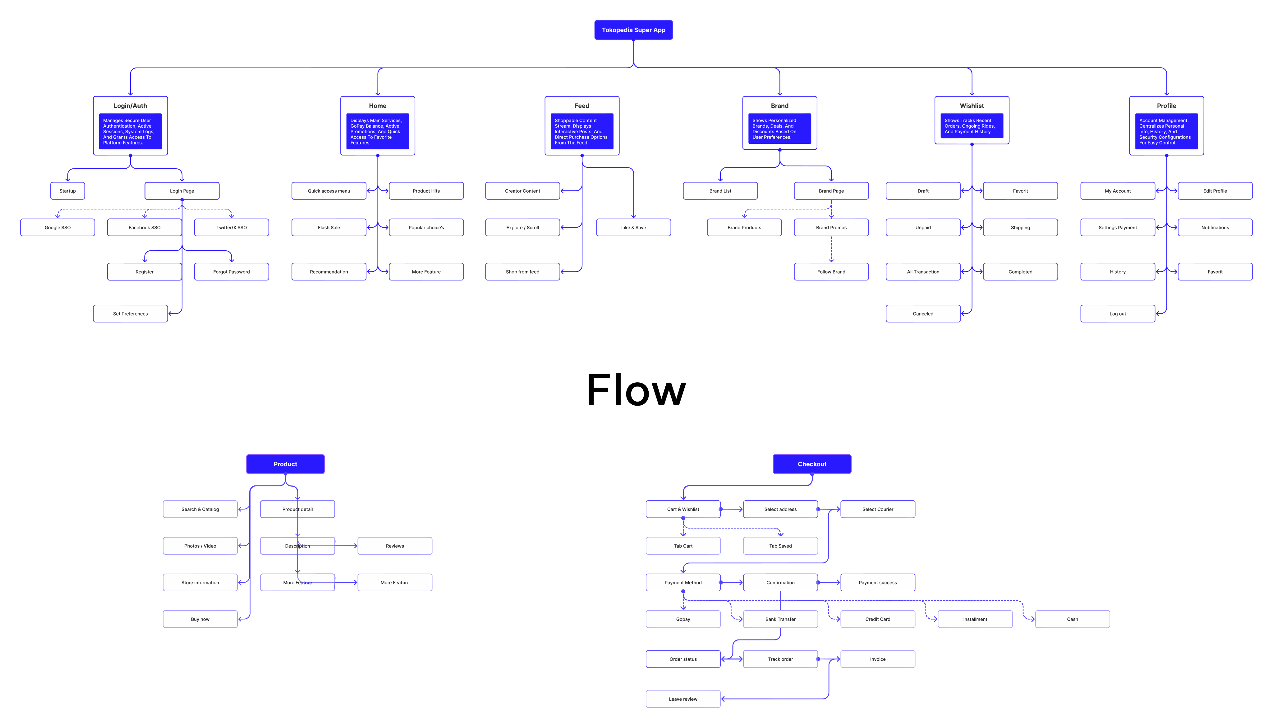
Ideation
Wireframing


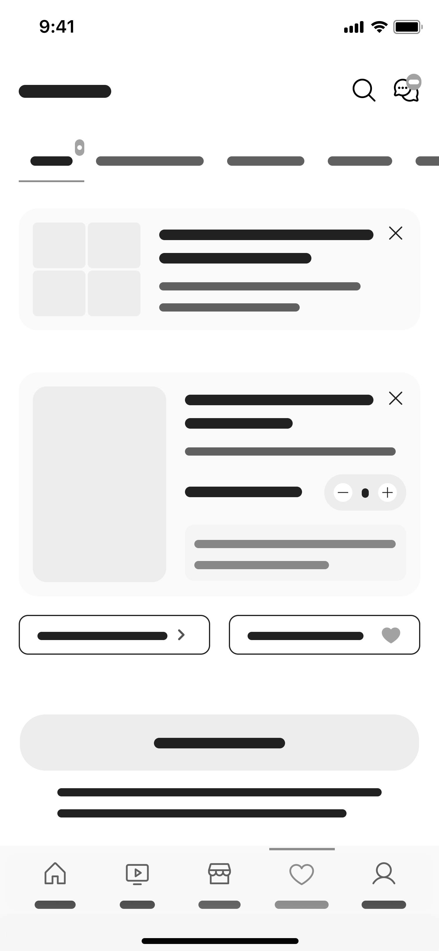


Prototyping
High Fidelity Mockups


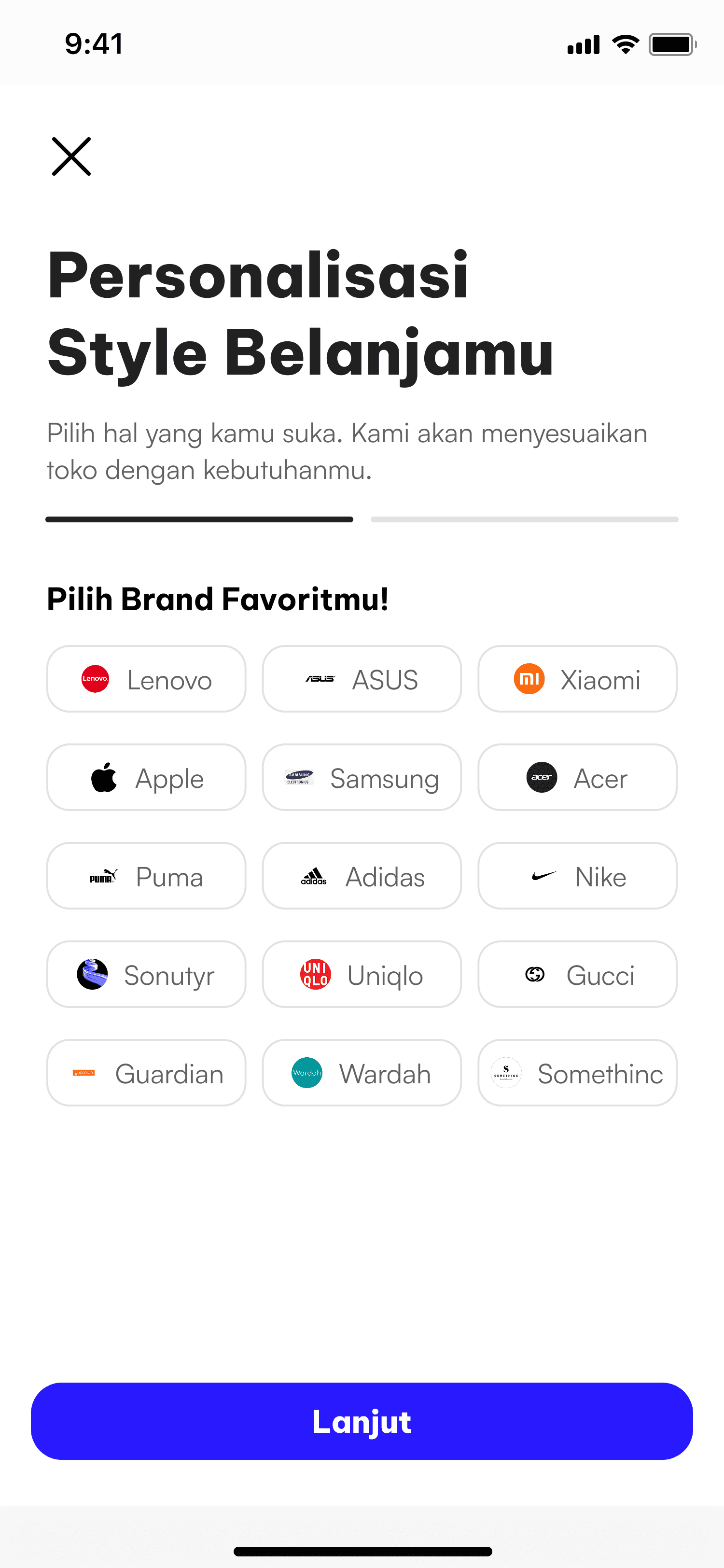


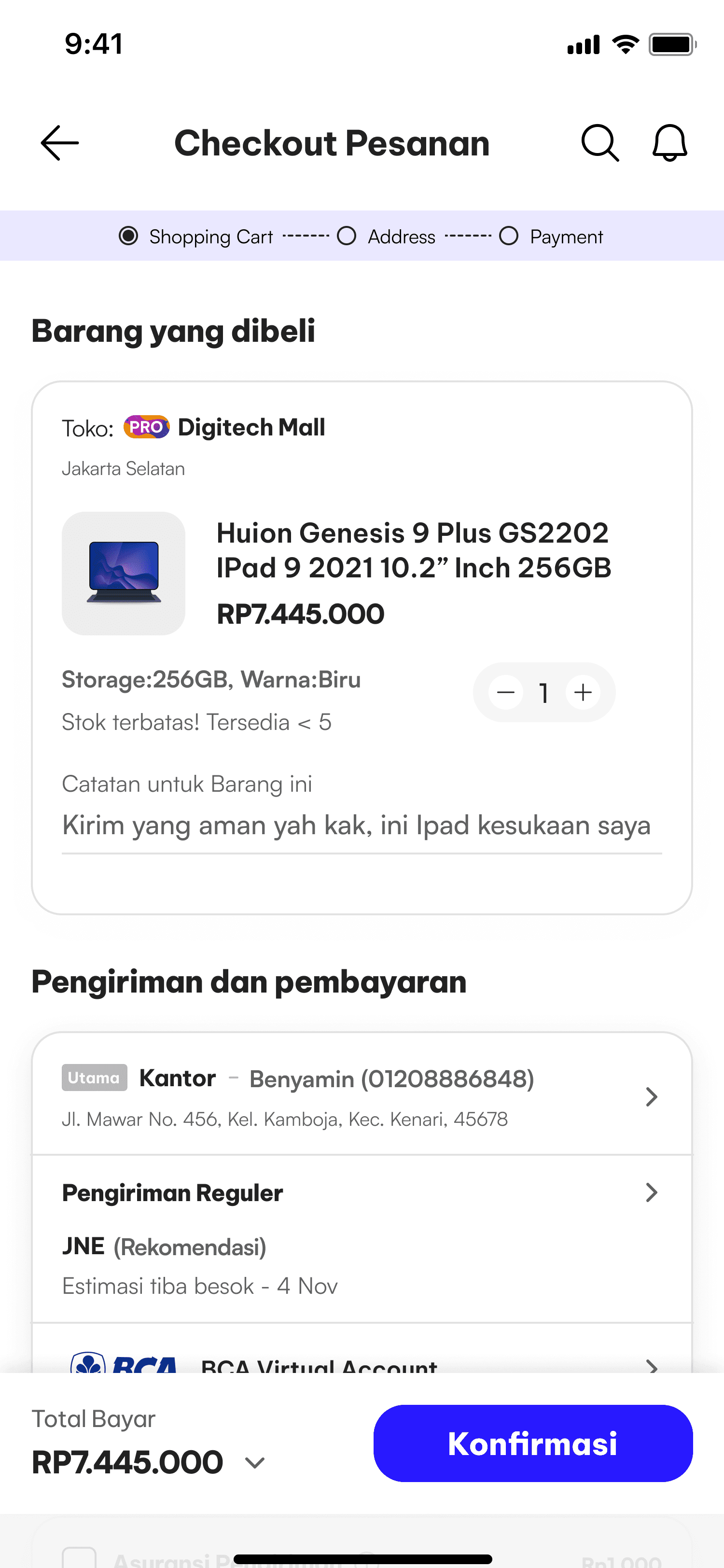


User Testing
Documented
2026
Design System
Be A Vietnam Pro
Primary Font
Ensures maximum legibility and a modern aesthetic across digital interfaces. Applied systematically to primary headlines, labels, and critical components for instant scannability.
Satoshi
Secondary Font
Optimized for dense body copy, metadata, and product descriptions. Its clean geometric proportions maintain a strong typographic hierarchy and reduce visual clutter.
+


+
Purple
Primary Color
Serves as the core brand anchor to drive user engagement. Applied systematically to primary call-to-actions (CTAs), active states, and key interactive touchpoints.
Grey
Neutral Color
Provides structural balance and accessible contrast across the layout. Used for backgrounds, borders, and secondary text levels to establish clean visual boundaries.
Closing
2026
Reflection


