Case Study

2026

Redefining The Gojek

Category Project

Internship Project

Duration

10 Weeks

Year

2024

Participant

Daffa Nazhiiff Muttahar

Role

UX/UI Designer

This redesign project reimagines the Gojek app experience to simplify navigation. Through iterative wireframing and prototyping, I developed a cleaner, scalable interface that improves daily task efficiency while preserving Gojek’s strong brand identity.

This redesign project reimagines the Gojek app experience to simplify navigation. Through iterative wireframing and prototyping, I developed a cleaner, scalable interface that improves daily task efficiency while preserving Gojek’s strong brand identity.

Overview

2026

Problem

Focused Discovery

Focused Discovery

Focused Discovery

Streamlining the homepage interface to eliminate visual noise and guide attention toward essential shopping features.

Streamlining the homepage interface to eliminate visual noise and guide attention toward essential shopping features.

Scannable Layouts

Scannable Layouts

Scannable Layouts

Reorganizing product detail pages with strict typographic hierarchy for instantaneous price and specification scanning to build trust.

Reorganizing product detail pages with strict typographic hierarchy for instantaneous price and specification scanning to build trust.

Linear Checkout

Linear Checkout

Linear Checkout

Designing a transparent, straight-through transaction flow that presents total costs clearly, accelerating final decision-making.

Designing a transparent, straight-through transaction flow that presents total costs clearly, accelerating final decision-making.

Solution

Core Services

04

Navigation Speed

2X

Visual Clutter

-60%

Structural Optimization

Restructuring the primary navigation defers secondary services and elevates core offerings. This strategic reduction in top-level choices optimizes the interface for speed, immediate clarity, and habitual daily usage.

Consolidated Ecosystem

Fragmented promotional pages are unified into a single, cohesive flow. Reorganizing the service grid establishes a strict visual hierarchy, significantly reducing cognitive friction for everyday users.

Research

Auditing Current App

To gain deeper insights into Gojek’s existing experience, I conducted a comprehensive audit assessing its navigation flow, interface clarity, and overall usability.

To gain deeper insights into Gojek’s existing experience, I conducted a comprehensive audit assessing its navigation flow, interface clarity, and overall usability.

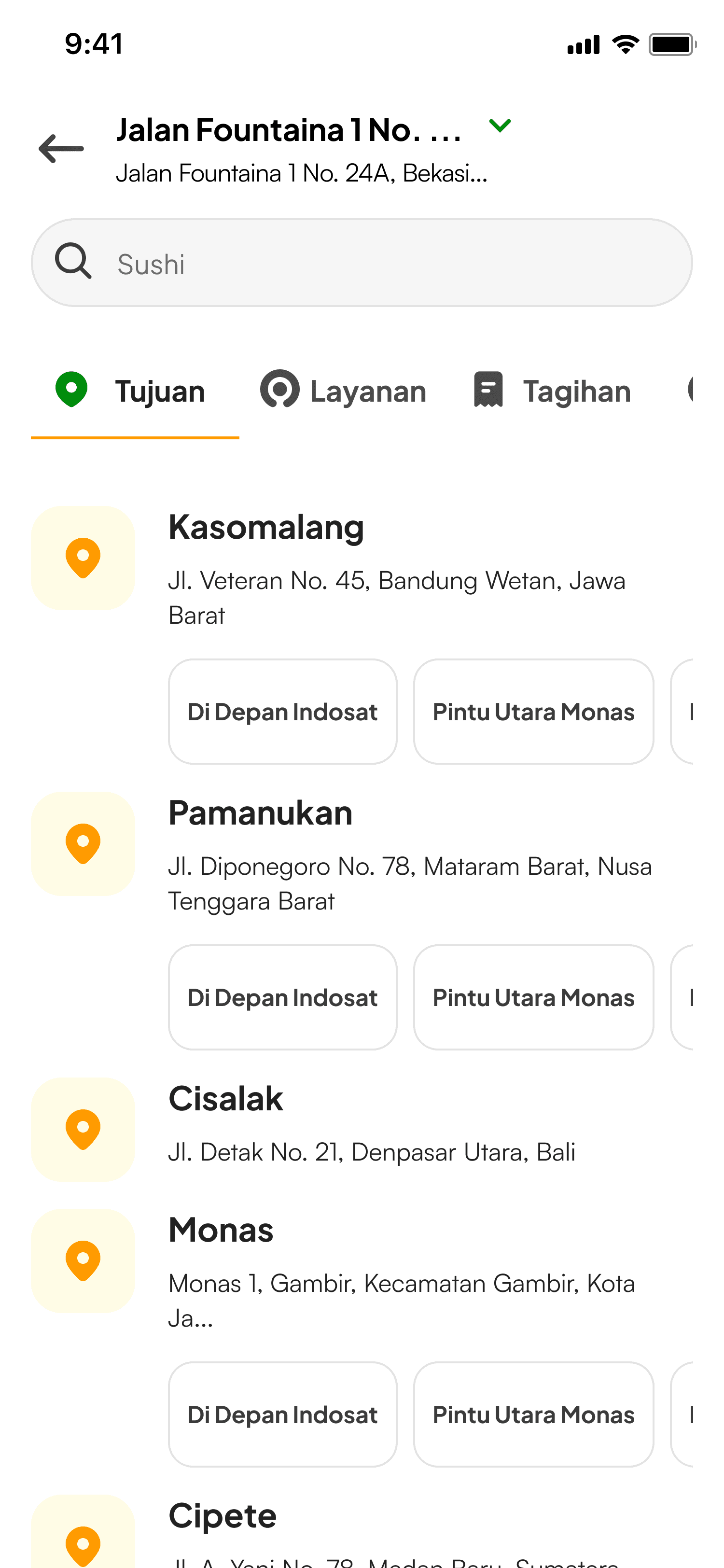
Bottom Navigation Bar

Abstract blue shapes create an interesting pattern.

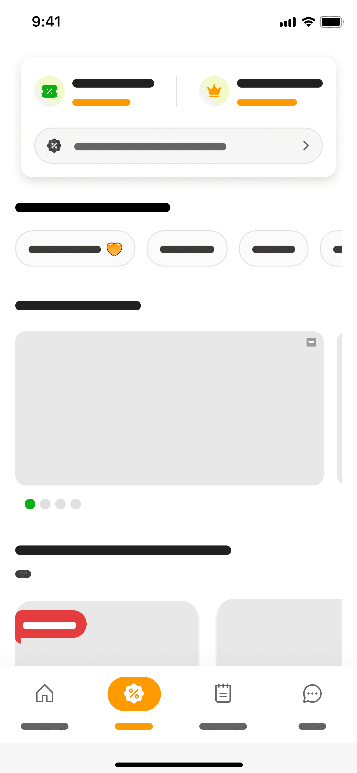
Wallet Overview Header

Abstract blue shapes create an interesting pattern.

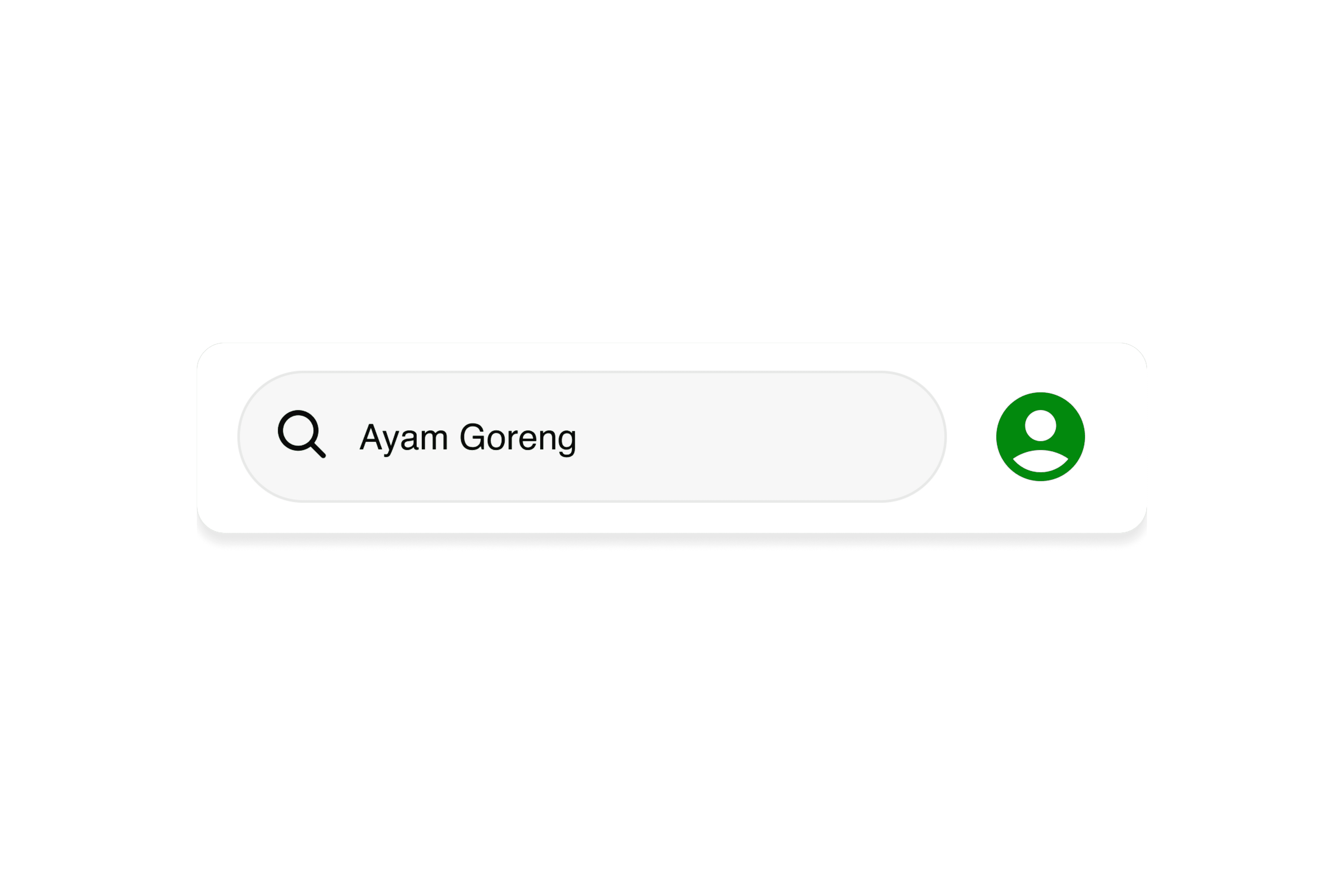
Search Bar

Abstract blue shapes create an interesting pattern.

Category Filter

Abstract blue shapes create an interesting pattern.

Service Grid Menu

Abstract blue shapes create an interesting pattern.

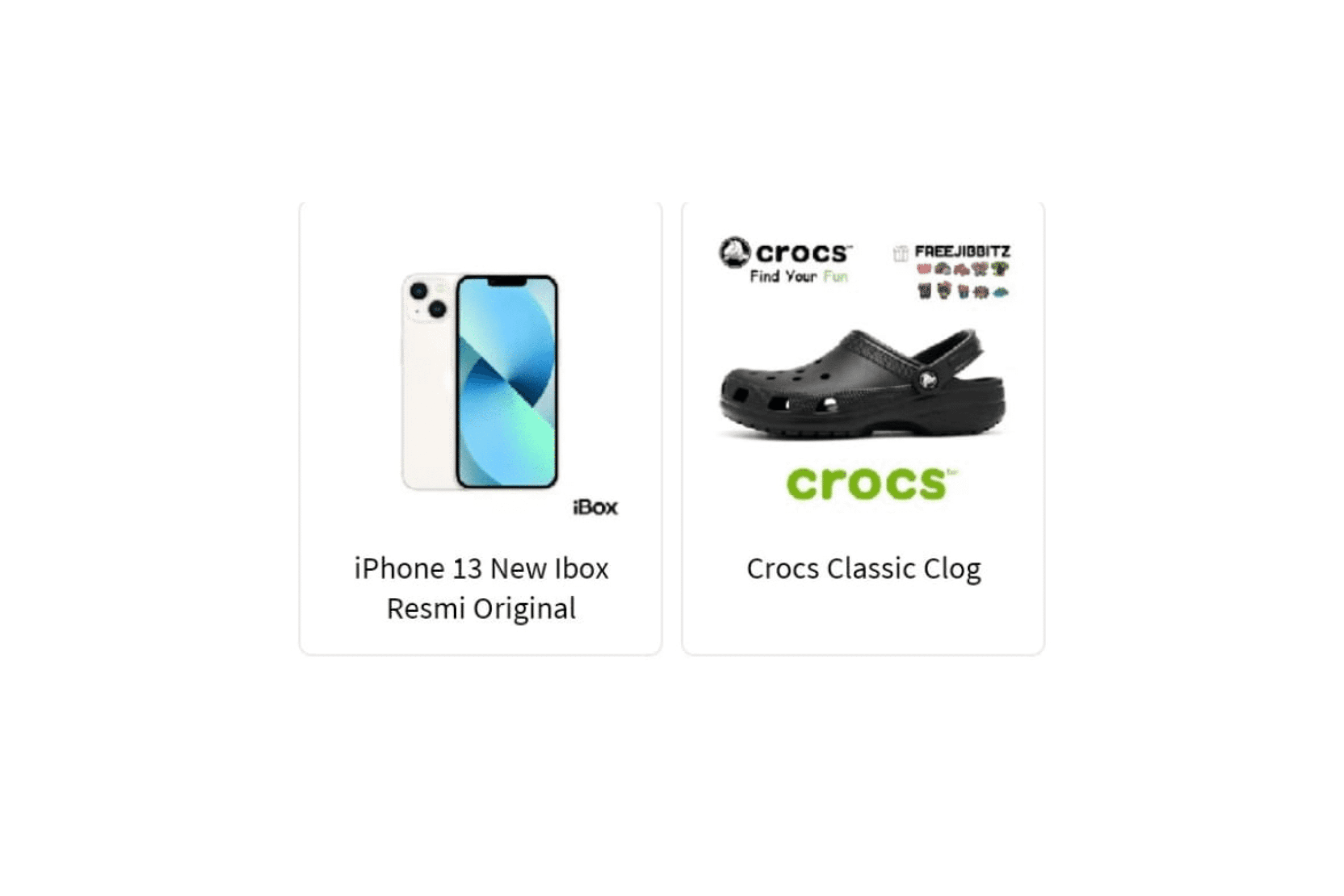
Store Information Header

Abstract blue shapes create an interesting pattern.
Analyzing Similiar Apps

I analyzed several comparable services to identify best practices and innovative features that could be incorporated into my redesign.

I analyzed several comparable services to identify best practices and innovative features that could be incorporated into my redesign.

Bottom Navigation Bar

Abstract blue shapes create an interesting pattern.

Wallet Overview Header

Abstract blue shapes create an interesting pattern.

Search Bar

Abstract blue shapes create an interesting pattern.

Category Filter

Abstract blue shapes create an interesting pattern.

Service Grid Menu

Abstract blue shapes create an interesting pattern.

Store Information Header

Abstract blue shapes create an interesting pattern.
Ideation

Based on the ideation process, I restructured the navigation to make core services easier to access and reduce visual complexity. The following sitemap comparison shows how the original structure was simplified into a more focused and task oriented layout.

Based on the ideation process, I restructured the navigation to make core services easier to access and reduce visual complexity. The following sitemap comparison shows how the original structure was simplified into a more focused and task oriented layout.

Wireframing

I translated the core problems into low fidelity layouts, focusing on simplifying the home structure, prioritizing the four primary services, and creating a more direct transaction flow before moving into visual design.

I translated the core problems into low fidelity layouts, focusing on simplifying the home structure, prioritizing the four primary services, and creating a more direct transaction flow before moving into visual design.

Prototyping

Since the overall layout and structure were already clear, I moved into flow prototyping. This allowed me to quickly test how the main services were prioritized, how the navigation felt, and whether the transaction flow was easy to follow.

Since the overall layout and structure were already clear, I moved into flow prototyping. This allowed me to quickly test how the main services were prioritized, how the navigation felt, and whether the transaction flow was easy to follow.

High Fidelity Mockups

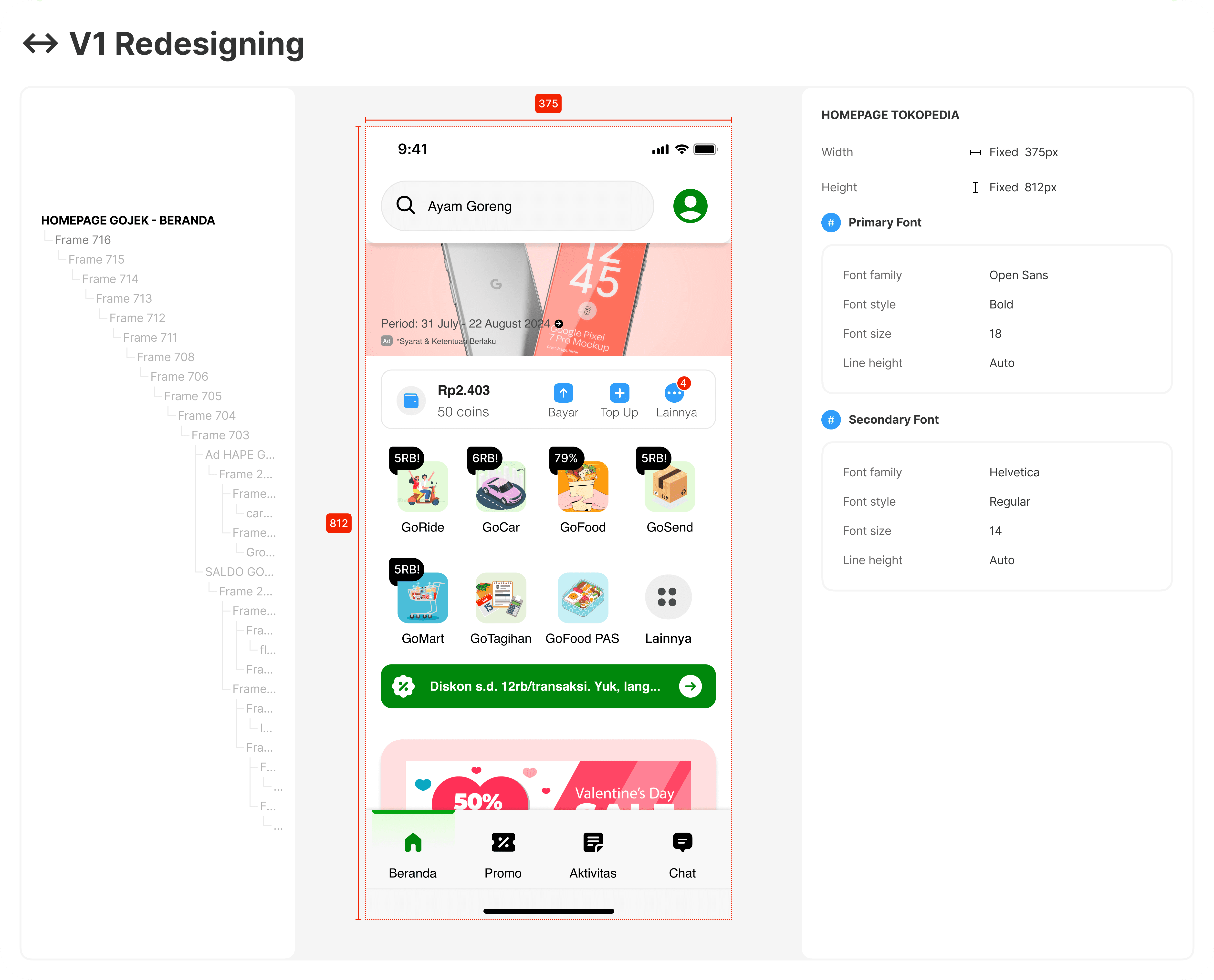
At this stage, I refined the typography, spacing, and component behavior across the key screens. The focus was on creating a simpler home experience, highlighting the most frequently used services, and building a consistent visual system.

At this stage, I refined the typography, spacing, and component behavior across the key screens. The focus was on creating a simpler home experience, highlighting the most frequently used services, and building a consistent visual system.

User Testing

To validate the redesign, I conducted usability tests with a small group of users. The sessions focused on how easily they could access the main services, understand promotions, and complete transactions. The feedback helped refine the navigation, improve clarity on the home screen, and simplify the overall flow.

To validate the redesign, I conducted usability tests with a small group of users. The sessions focused on how easily they could access the main services, understand promotions, and complete transactions. The feedback helped refine the navigation, improve clarity on the home screen, and simplify the overall flow.

Documented

2026

Design System

Plus Jakarta Sans

Primary Font

Delivers clean geometric construction and maximum legibility across digital interfaces. Applied systematically to major headers, service labels, and critical UI components to establish immediate visual hierarchy and instant scannability.

Satoshi

Secondary Font

Optimized for dense body copy, transactional metadata, and detailed service descriptions. The clean proportions maintain a rigorous typographic structure, ensuring razor-sharp readability and reducing visual clutter across complex viewports.

+

About Image
About Image
About Image
About Image

+

Orange

Primary Color

Serves as the core brand anchor, reflecting energy, approachability, and everyday mobility. Applied strategically to primary call-to-actions (CTAs), active states, and key interactive touchpoints to drive engagement and highlight primary services.

Grey

Neutral Color

Provides essential structural balance and accessible contrast throughout the ecosystem. Utilized systematically for backgrounds, modular borders, and secondary typography to establish crisp visual boundaries and minimize cognitive fatigue.

Closing

2026

Reflection
Critical evaluation and guidance from senior designers provided fresh perspectives on structural weaknesses within initial iterations

Critical evaluation and guidance from senior designers provided fresh perspectives on structural weaknesses within initial iterations

Real Usage Drives Structure

Prioritizing the most frequently used services helped reduce decision time and made the home screen more intuitive.

Real Usage Drives Structure

Prioritizing the most frequently used services helped reduce decision time and made the home screen more intuitive.

Real Usage Drives Structure

Prioritizing the most frequently used services helped reduce decision time and made the home screen more intuitive.

Accessibility Standardization

The initial application of the primary brand color across multiple active states resulted in severe visual fatigue and accessibility contrast failures. The design system required a stringent rollback, limiting the primary accent strictly to high-priority conversion points to restore navigational clarity and reduce cognitive strain.

Accessibility Standardization

The initial application of the primary brand color across multiple active states resulted in severe visual fatigue and accessibility contrast failures. The design system required a stringent rollback, limiting the primary accent strictly to high-priority conversion points to restore navigational clarity and reduce cognitive strain.

Accessibility Standardization

The initial application of the primary brand color across multiple active states resulted in severe visual fatigue and accessibility contrast failures. The design system required a stringent rollback, limiting the primary accent strictly to high-priority conversion points to restore navigational clarity and reduce cognitive strain.

© 2026 Nazzh

®. All rights reserved.

© 2026 Nazzh

®. All rights reserved.

© 2026 Nazzh

®. All rights reserved.

Create a free website with Framer, the website builder loved by startups, designers and agencies.